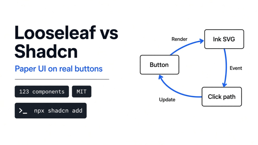
Looseleaf vs shadcn comes down to one question: should your buttons look like software or like paper? You already have a login form. The buttons are flat, grey, and identical to every other admin tool on your laptop. A friend asks for something that looks like a notebook. You do not want to rebuild the form.
Both give you the same named pieces of a page. Shadcn paints them flat. Looseleaf draws them with a pen, and it leaves the click on a real button.
A web page is not a picture. The browser keeps a tree of boxes, and it draws that tree on the screen. That tree is the DOM (the boxes the browser actually draws). A component (one named box you reuse) is a button, a tab, or an input you can drop in more than once. React is the library that builds those boxes from JavaScript. The HTML-shaped lines inside that JavaScript are JSX (HTML written inside JavaScript). Hold those three ideas. Everything below is only a different coat on the same boxes.

What Is Shadcn?
Shadcn is a way to copy a button’s source into your own project, instead of calling a closed package you cannot edit. You run a command, and a file named button.tsx lands in your folder. After that, the button is your code.
The look comes from small style names, the kind Tailwind uses: height, padding, color, corner. The behavior, the part a keyboard user needs, comes from Radix (the piece that handles keyboard and focus). Open the shadcn button docs and you will see the same variant names people already type: default, destructive, outline, secondary, ghost, link.
That is why so many tools look related. They copied the same starting button and then changed colors. If your product should look like a normal tool, stay here. A bank screen, a billing page, or a dense table does not want a wobble.
What Is Looseleaf?
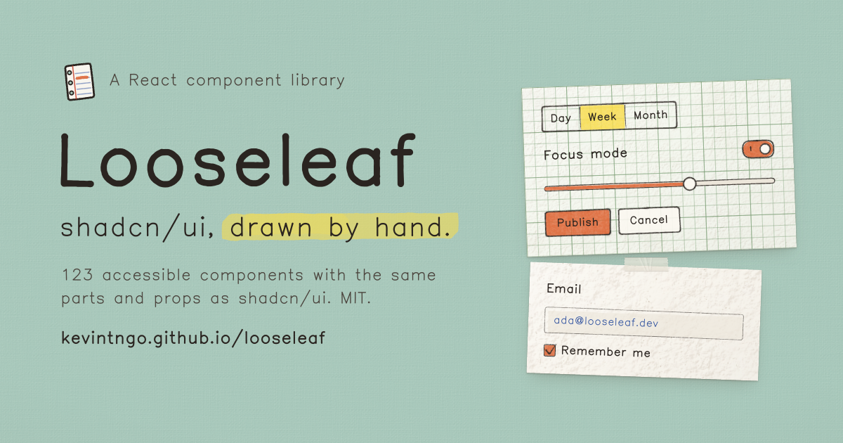
Looseleaf is that same set of parts, drawn as if they sat on paper. The Looseleaf project ships 123 components and 61 ready-made blocks (a login, a pricing page, a chat, a settings screen). The props keep the shadcn names, including data-slot, so a button in your JSX can stay a button in your JSX.
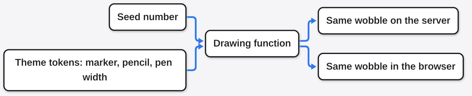
The pen line is not a photo of ink. It is an SVG (a picture made of lines, not pixels) that a function draws from a seed. Same seed, same wobble, on the server and in the browser. Colors and pen width are tokens, the named values a theme swaps, and those tokens sit on top of the names shadcn already uses. The license on the code, the drawings, and the Kevin Sans font is MIT. IBM Plex Mono, if you meet it in the files, is under a different font license.
Looseleaf vs Shadcn
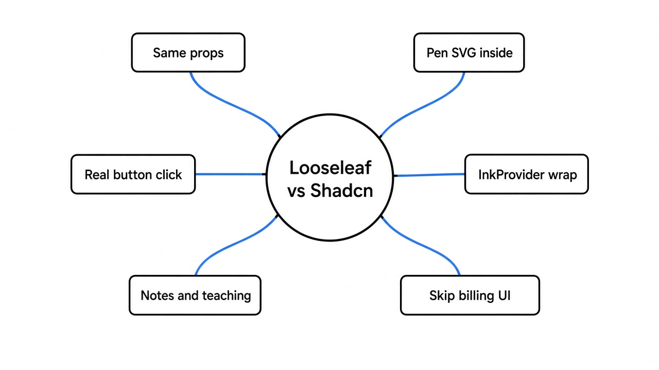
Use shadcn when the page should look like software. Use Looseleaf when the page should look like paper and you already speak shadcn’s prop names.
| shadcn | Looseleaf | |
|---|---|---|
| What the command copies | The component source | The component source, plus a drawing function and a theme |
| The thing you click | A real button | A real button, with the drawing inside it |
| Props you already know | variant, size, asChild, disabled | The same, plus an optional seed |
| Look | Flat, even corners | Pen outline, marker fill, a small drop line on hover |
| Keyboard | Radix, with a focus ring | The same path, plus a drawn focus ring |
| Right room | Product UI, tables, billing | Notes, teaching, a personal app, a landing page with personality |
The row that matters is the second one. A pretty outline that is only a picture will not take a keyboard. Looseleaf does not do that. I checked the file the installer would copy, in the next section.
If you are choosing a look because a generated page feels generic, that is a different job. Layout and type fix that, not a pen skin swapped onto a button you already have. And if the real need is to open a designer’s mockup rather than restyle code, opening a Fig file with no account is a separate problem with a separate tool.
How Do I Add Looseleaf to Shadcn?
Add the registry once, then ask for the piece you need. A registry here is only a URL that returns source files.
In components.json:
{
  "registries": {
    "@looseleaf": "https://kevintngo.github.io/looseleaf/r/{name}.json"
  }
}Then:
npx shadcn@latest add @looseleaf/buttonI did that fetch by hand, without the installer, so I could see the payload. https://kevintngo.github.io/looseleaf/r/button.json came back fine. The file was 12,137 bytes. Inside it were two sources: src/components/ui/button.tsx (3,974 characters) and src/lib/ink/recipes/button-ink.ts (5,565 characters). The dependency list was class-variance-authority and radix-ui. The file also pointed at two more registry URLs, ink.json and looseleaf-theme.json. So “add a button” is not one file. You also take the drawing engine and the theme.
The sample that ships with those files wraps the page like this:
import { InkProvider } from "@/lib/ink/react"
import { Button } from "@/components/ui/button"

export function App() {
  return (
    <InkProvider>
      <Button>Save changes</Button>
    </InkProvider>
  )
}Skip InkProvider and the button code is present, but the pen layer has nowhere to attach. If the theme did not bring Kevin Sans, the font file is a single CSS import: https://kevintngo.github.io/looseleaf/fonts/kevin-sans.css.
A login block, if you want a whole screen instead of one button, is @looseleaf/login-01. The full set is @looseleaf/looseleaf. Start with the button. You can see whether the pen belongs on your page before you copy sixty blocks.
Why the Drawing Does Not Steal the Click
The drawing sits inside the button. It does not replace the button.
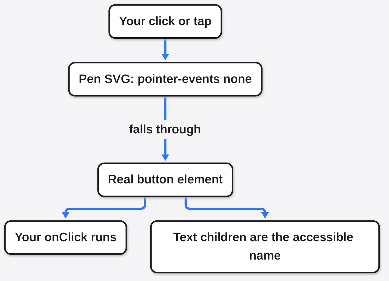
In the button.tsx from that payload, the normal path returns a real <button>. The drawing node is the first child. The words you pass in, children, come after it. The class string on that button includes [&_svg]:pointer-events-none. Pointer events are the browser’s name for “who receives the click.” None, on the SVG, means the click falls through to the button. The words stay the thing a screen reader reads. The lines are decoration.
Disabled is the HTML attribute disabled on that same button, not a picture of a grey button. The asChild path is the escape hatch shadcn uses when you want the styles on a link instead of a button. There, disabled becomes aria-disabled, tabIndex set to -1, and a click handler that calls preventDefault. I would still try that path with a keyboard before you ship a disabled link, because it is the one branch that is not a native button.
The drawing recipe has five layers: rest, hover, pressed, focus, disabled. Focus and pressed are lazy, which means they are drawn when that state happens, not on the first paint. Focus calls focusRing. Disabled, for a normal button, paints a dashed box and returns. It does not keep the solid marker fill. Hover on the default button draws a short line offset down and to the right, the little pen shadow. A button wider than 360 pixels sets a simpler outline so the wobble does not smear across a long label. That cutoff is a constant in the recipe, WIDE_PX = 360.
The click path above is what those two files do today. If a later copy moves the drawing outside the button, this stops being true. Re-download button.json and check that pointer-events-none is still on the SVG. Then tab to the button. The focus ring should be the drawn one, and the words should still be the accessible name.
Can I Swap Shadcn for Looseleaf Without Rewriting JSX?
Yes for a button that already uses those prop names. No if your JSX depends on shadcn’s exact class soup.
The variant list in the drawing file is default, destructive, outline, secondary, ghost, link. The size list is default, xs, sm, lg, icon, icon-xs, icon-sm, icon-lg. The element sets data-slot="button", data-variant, and data-size. If your page says <Button variant="outline" size="sm">, that call still matches.
Two things you will touch. Wrap the tree in InkProvider, as the sample does. Pass seed only when you need this button’s wobble to stay put on the next render. Leave the seed off and the function may pick a new wobble. That is a feature for a sticker, and a bug for a button people stare at all day.
rounded-full in your class name is special. The button code looks for that exact token and tells the drawing to use a pill. Other corner classes are not read that way. If you rounded a button with a different class, the pen box can stay a small radius while your old CSS expected a circle.
This is the same idea as a chat answer that is a kit of parts, not a blank page. The model, or you, picks from parts that already know how to be clicked. You do not get a free drawing of a button that only looks clickable.
When Not to Use Looseleaf
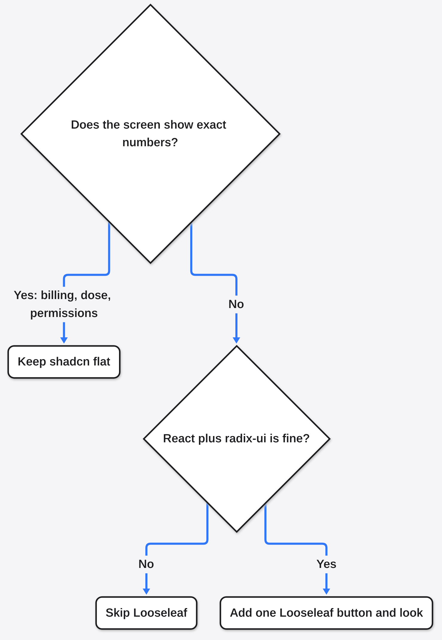
Do not use it on a screen where a wobble makes the number feel less exact. Revenue, a medical dose, a permission grid: keep the flat button. The pen is a tone. It is not a better button.
Do not use it if you are not in React, or if you cannot accept radix-ui and class-variance-authority in the dependency list. Those two names were on the button payload I fetched. Do not copy all 123 components “so they are there.” That is the same habit as adding pieces the task did not ask for. Add the button, or the login block, and stop.
Do not expect the drawing to fix a bad layout. A paper skin on a cramped form is still a cramped form. If the job is “this generated page looks like every other generated page,” start with layout and type, then decide if paper is even the right coat. If an AI agent is writing that layout for you, asking it for real diagrams instead of ASCII boxes is the same instinct: pick the right medium before the styling.
Common questions about Looseleaf vs Shadcn
Is Looseleaf Free?
Yes. The code, the drawings, and Kevin Sans are MIT. You can use them in a personal project or a company product. Read the font file if you ship IBM Plex Mono with it, because that font is not under the MIT grant.
Does Looseleaf Work With Tailwind?
Yes. The button classes are Tailwind utility names, including the press sink and the hover wipe. You still need the Looseleaf theme tokens, because the pen colors are names like marker and pencil that the theme defines. Adding the button through the registry pulls that theme. Pasting only button.tsx into an old folder will not.
Will My Existing Button Props Still Work?
The variant and size names above match. disabled and asChild are in the component. className is merged, and rounded-full changes the drawn shape to a pill. A class that only existed to fake a focus ring in your old CSS may now stack on top of the drawn focusRing. Delete the fake ring after you see both.
Is the Drawing Bad for Screen Readers?
Not by itself. The words are real children of a real button, and the SVG is marked so it does not take the click. A screen reader reads the button name, not the pen path. What would be bad is a button whose only label is a drawing, with no text and no accessible name. Do not do that here, and do not do it with shadcn either.
I would put Looseleaf on a notes app, a class site, or a personal tool whose buttons already use those props. I would leave a billing page on shadcn. The swap is a coat. The button underneath is the part I checked.